
自定义装修组件.md 23 KB
自定义装修组件
装修功能实现原理
装修功能基本上是在前端实现的,后台提供接口保存一个装修页面的配置信息,前端页面通过指定的装修页面id请求到配置内容,然后渲染出来。
装修组件的组成
- 后台管理系统中装修组件:用于在后台管理页面配置、预览装修内容在前端的展示效果;
- 前端项目中的装修组件:用于在C端(PC端、移动端)请求到装修数据后的展示;
PC端自定义装修组件
PC端装修功能目录说明
在后台管理项目中,PC端装修功能目录: /src/views/modules/fitment/decorate/create
目录概览:
create
├─common-component
├─edit
│  └─components
│      ├─all-can-use-components		所有可用组件配置。每一个装修组件主体都要引入到这里,并且完成配置信息;
│      ├─basic-component			基础组件目录
│      ├─component-management		组件管理组件
│      ├─decorate-navbar			装修页面的导航条
│      ├─extend-component			扩展组件目录
│      ├─marketing-activities		营销活动组件目录
│      └─right-config-message		右侧公共配置组件。每一个装修组件的配置模块都需要引入到这里
└─select-decorate					预览装修页面
后台管理页面中目前根据组件类型划分了三种类型的组件,在项目代码中对应其目录名称:
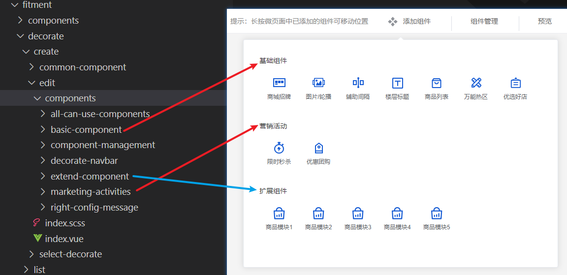
新增组件
首先确认要新增的组件类型,在对应目录创建新的组件目录。pc端装修组件目录固定配置:
组件名称
├─components
│  └─right-tool.vue		组件右侧的配置信息配置
└─index.vue				组件内容
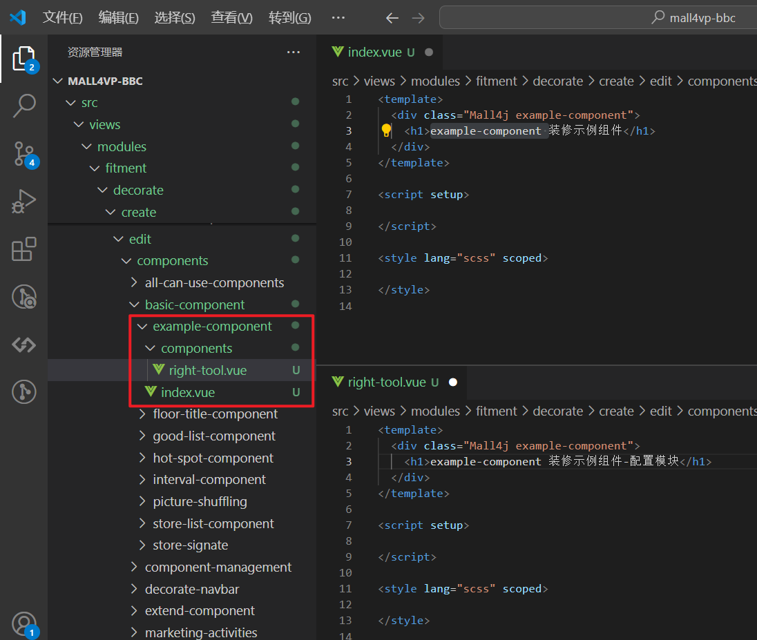
这里在 基础组件 中新增一个装修示例组件 example-component ,则在 basic-component 创建如下内容
然后将这个组件以及组件的配置文件分别添加到 all-can-use-components 和 right-config-message ,并完成相关配置
- 将组件添加到组件列表
all-can-use-components
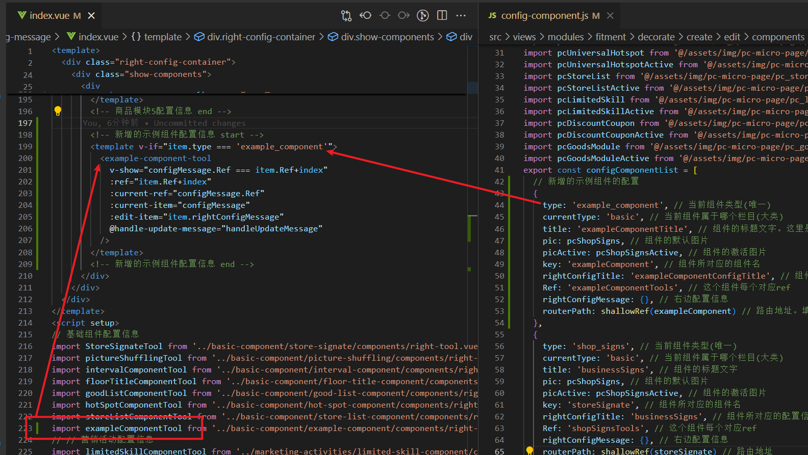
在 all-can-use-components/config-component.js 新增以下代码
  ...
  // 引入新增组件
  import exampleComponent from '../basic-component/example-component/index.vue' // 示例组件

  export const configComponentList = [
    // 新增的示例组件的配置
    {
      type: 'example_component', // 当前组件类型(唯一)
      currentType: 'basic', // 当前组件属于哪个栏目(大类)
      title: 'exampleComponentTitle', // 组件的标题文字。这里是basic类型组件,则配置在pcdecorate.baseComponent.xxx
      pic: pcShopSigns, // 组件的默认图片
      picActive: pcShopSignsActive, // 组件的激活图片
      key: 'exampleComponent', // 组件所对应的组件名
      rightConfigTitle: 'exampleComponentConfigTitle', // 组件配置的标题。在国际化配置 pcdecorate.componentTitle.xxx
      Ref: 'exampleComponentTools', // 这个组件每个对应ref
      rightConfigMessage: {}, // 右边配置信息
      routerPath: shallowRef(exampleComponent) // 路由地址。填写上方引入的新增的示例组件
    }
    ...
  ]

将组件配置添加到右侧公共配置组件
right-config-message<template> ... <div class="show-components"> <div v-for="(item, index) in currentUseComponents" :key="index" > <!-- 新增的示例组件配置信息 start --> <template v-if="item.type === 'example_component'"> <example-component-tool v-show="configMessage.Ref === item.Ref+index" :ref="item.Ref+index" :current-ref="configMessage.Ref" :current-item="configMessage" :edit-item="item.rightConfigMessage" @handle-update-message="handleUpdateMessage" /> </template> <!-- 新增的示例组件配置信息 end --> </div> </div> ... </template> <script setup> ... import exampleComponentTool from '../basic-component/example-component/components/right-tool.vue' // 示例组件配置组件 .... </script>
在
decorate/create/edit/index.vue的handleUpdateMessage方法中添加该类型组件,当右边配置内容更新时同步修改装修页面的组件配置// 右边配置信息的改变 const handleUpdateMessage = (obj) => { let arr = [] arr = JSON.parse(JSON.stringify(currentUseComponents.value)) // 头部信息 HeaderComponent.value.forEach(v => { if (v.Ref + '-1' === obj.ref) { v.rightConfigMessage = { ...obj.config } } }) arr.forEach((item, index) => { if (item.type === 'picture_by') { // 图片轮播 if (item.Ref + index === obj.ref) { item.rightConfigMessage = { ...obj.config } } ... // 其他组件 } else if (item.type === 'example_component') { // 添加这个示例组件。根据创建时设定的组件类型,返回自定义的内容 if (item.Ref + index === obj.ref) { item.rightConfigMessage = { ...obj.config } } } } }
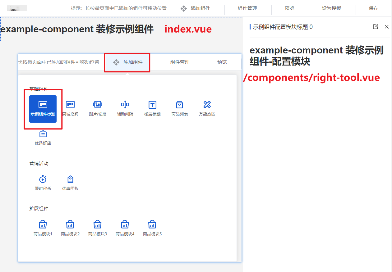
至此,可以在添加组件弹窗中看到这个新增的组件,点击添加可以把组件加到页面上:
页面主体中显示 index.vue,选中组件右侧会显示配置组件components/right-tool.vue
添加组件功能
新增组件完毕后,接下来就是给组件添加功能。
假设当前组件需要实现一个配置标题的功能,可以配置文本内容、字体的大小和颜色。则在组件中写入以下代码
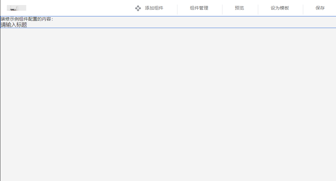
example-component/index.vue
<template>
  <div class="Mall4j example-component">
    <!-- <h1>example-component 装修示例组件</h1> -->
    装修示例组件配置的内容:
    <div
      class="example-component-title"
      :style="{ fontSize: config.titleFontSize + 'px', color: config.titleColor }"
    >
      {{ config.title || '请输入标题' }}
    </div>
  </div>
</template>

<script setup>
// 接收的参数
const props = defineProps({
  itemComponent: { // 组件信息
    type: Object,
    default: () => {}
  }
})

// 当前页面展示的配置
const config = ref({})

// 监听组件右侧配置更新,实时同步到当前配置中
watch(() => props.itemComponent, (newVal) => {
  if (JSON.stringify(newVal.rightConfigMessage) != '{}') {
    config.value = {
      title: newVal.rightConfigMessage.title,
      titleFontSize: newVal.rightConfigMessage.titleFontSize,
      titleColor: newVal.rightConfigMessage.titleColor
    }
  } else {
    config.value = {
      title: '',
      titleFontSize: 16,
      titleColor: '#333333'
    }
  }
}, {
  deep: true,
  immediate: true
})
</script>
example-component/components/right-tool.vue 组件配置
<template>
  <div class="Mall4j example-component">
    <!-- <h1>example-component 装修示例组件-配置模块</h1> -->
    <el-form
      v-model="configForm"
      label-width="auto"
    >
      <el-form-item
        label="标题"
        required
      >
        <el-input
          v-model="configForm.title"
          placeholder="请输入标题"
        />
      </el-form-item>
      <el-form-item label="字体大小">
        <el-slider
          v-model="configForm.titleFontSize"
          :min="12"
        />
      </el-form-item>
      <el-form-item label="字体颜色">
        <el-color-picker v-model="configForm.titleColor" />
      </el-form-item>
    </el-form>
  </div>
</template>

<script setup>

// 当前组件的配置信息
const configForm = ref({
  title: '', // 标题内容
  titleFontSize: 16, // 标题字体大小
  titleColor: '#333333' // 标题字体颜色
})

// 接收的参数
const props = defineProps({
  currentRef: { // 当前组件的ref
    type: String,
    default: () => ''
  },
  currentItem: { // 点击当前组件回显右边配置信息
    type: Object,
    default: () => {}
  },
  editItem: { // 当前已经配置信息
    type: Object,
    default: () => {}
  }
})

// 监听组件回显
watch(() => props.currentItem, (newVal) => {
  if (newVal.currentConfigType === 'example_component') {
    if (JSON.stringify(newVal.config) !== '{}') {
      configForm.value = { ...newVal.config }
    }
  }
})

// 同步预览区域的方法
const emit = defineEmits(['handleUpdateMessage'])

// 监听当前组件配置,发生改变时同步到预览区域
watch(() => configForm.value, (newVal) => {
  const obj = {
    type: 'example_component',
    ref: props.currentRef,
    config: newVal
  }
  // 同步到预览区域
  emit('handleUpdateMessage', obj)
}, { deep: true })

/**
 * 当前组件的校验方法
 * @return {status: boolean, message: string} status为true表示校验通过,否则弹出 message 提示内容
 */
const handleValidate = () => {
  let status
  let message = ''
  if (JSON.stringify(props.editItem) === '{}') {
    status = false
    message = '请先配置组件内容'
  } else if (!props.editItem.title.trim()) {
    status = false
    message = '标题不能为空'
  } else {
    status = true
  }
  return {
    status,
    message
  }
}
defineExpose({ handleValidate })
</script>
组件配置中除了组件自身实现的功能代码以及对应的校验代码外,大多数代码可以参考现有组件编写,需要注意要修改下组件类型(type)的值。
至此,后台管理端PC的组件添加已经完成:
PC项目中添加组件
后台管理新增组件完毕后,要在PC项目中也添加对应的组件用来在前端界面渲染。PC项目装修组件目录为 src/components/decorate-component
渲染的组件已经在后台管理系统中写好了,理论上只需要将 example-component 组件从后台管理系统项目拷贝到该目录下,然后移除组件目录下的 components 配置就可以了。

PC端添加组件后同样需要在组件配置中添加该组件的类型,打开当前目录下 pageConfig.js 配置文件
// src/components/decorate-component/common/pageConfig.js

//...其他引入
// 引入示例组件
import exampleComponent from '../example-component/index.vue'

// 组件的配置
export const configComponentList = [
    // 添加新增的组件配置 type类型与后台新增的保持一致
  {
    type: 'example_component',
    components: shallowRef(exampleComponent),
    rightConfigMessage: {}
  },
  ...
]
至此PC端自定义装修组件就完成了,在后台管理系统-装修功能-PC端装修-页面管理中把该组件添加到设为主页的装修页中,就可以看到效果

移动端自定义装修组件
移动端组件装修目录
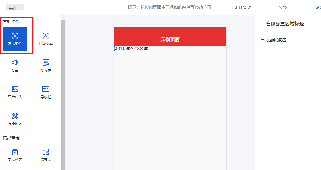
在后台管理项目中,移动端装修功能目录: /src/views/modules/fitment/feature/create
目录概览:
create
├─edit					新增、编辑装修页
│  └─components			所有的装修组件
└─RightPanel
新增组件
在 /feature/create/edit/components 目录创建一个新的组件,并写入以下代码:
提示:在新增组件的时候可以使用以下代码作为模板,然后在 组件功能预览区域 和 组件配置 区域补充功能代码并完善校验等内容。
<!--  example-component/index.vue  -->
<template>
  <div class="Mall4j component-example-component">
    <!--  组件预览区域  -->
    <div class="design-preview-controller">
      组件功能预览区域
    </div>
    <!--  右侧组件配置内容  -->
    <div
      v-show="isShowEdit"
      class="design-editor-item design-hide-class"
    >
      <div class="design-config-editor">
        <div class="design-editor-component-title">
          <!--     组件标题 & 自定义标签     -->
          <div style="flex: 1;">
            右侧配置区域标题
            {{ currentComponent.customRemark }}
          </div>
          <!--     修改自定义标签弹窗     -->
          <custom-remark-edit-popover
            :index="currentUseComponents.findIndex(item => item.id === currentComponent.id)"
            :current-edit-component="currentEditComponent"
            @set-current-component="setCurrentComponent"
            @save-edit="saveCustomRemark"
          />
        </div>
        <!--    组件配置    -->
        <div class="design-editor-component-container">
          当前组件的配置
        </div>
      </div>
    </div>
  </div>
</template>

<script setup>
import customRemarkEditPopover from '../../../../../components/custom-remark-edit-poppver/index.vue'
const props = defineProps({
  isCheckMySelf: { // 是否开始内部验证 比如提示弹窗等。。。
    type: Boolean,
    default: false
  },
  currentComponent: { // 当前组件
    type: Object,
    default: () => {
      return {}
    }
  },
  indexKey: { // 当前组件排序索引 type_ + key
    type: String,
    default: () => {
      return ''
    }
  },
  current: { // 当前排序索引 key
    type: Number,
    default: () => {
      return null
    }
  },
  isShowEdit: { // 是否为编辑状态
    type: Boolean,
    default: false
  },
  dataField: { // 所有上传到后端的字段
    type: Object,
    default: () => { }
  },
  isStartCheckFieldRules: { // 是否开始校验规则
    type: Boolean,
    default: () => false
  },
  currentUseComponents: {
    type: Array,
    default: () => {}
  }
})
const emit = defineEmits(['myCheckResult', 'componentsValueChance', 'onErrorMessageTip'])

</script>

<style lang="scss" scoped>

</style>
与PC的组件类似,创建完成后需要引入到公共的组件列表中,并完成配置:
/edit/components/all-can-use-components/compRouterData.js
// ..其他引入
import exampleComponent from '../example-component/index.vue'

// 注意配置组件的时候在第二项后插入,因为前两项为头部组件,根据索引有部分操作,如果写在之前会导致不可预料的问题
export const componentLists = [
  {
    type: 'config', // 组件名称标识
    title: $t('shopFeature.allCanUse.config'),
    isHide: true, // 是否隐藏选择
    isHeader: true, // 是否为头部
    routerPath: shallowRef(header) // 路由地址
  },
  { // 公共广告头部配置
    type: 'config_common_ad',
    title: $t('shopFeature.allCanUse.config'),
    isHide: true, // 是否隐藏选择
    isHeader: true, // 是否为头部
    routerPath: shallowRef(headerAD)
  },
  // 配置新增的组件信息
  {
    type: 'example_component', // 组件类型,唯一标识
    title: '演示组件', // 组件标题名称
    pic: pTextPng, // 组件图标
    picActive: pTextActivePng, // 激活时的组件图标
    routerPath: shallowRef(exampleComponent) // 组件地址
  }
  // ...
]
新增的组件默认添加到 基础组件 一栏
如果要进行分组处理,根据之前设置的组件类型在 /all-can-use-components/index.vue 中的组件分组方法中操作:
/**
 *  组件分组
 */
const groupcomponent = () => {
  const baseListPar = []
  const shopDisListPar = []
  const extendComponentPar = []
  for (let i = 0; i < componentLists.value.length; i++) {
    const item = componentLists.value[i]
    if (item.type === 'promotionalActivities' || item.type === 'goods' || item.type === 'goodsWaterfall') {
      shopDisListPar.push(item)
    } else if (item.type === 'goodsModule1' || item.type === 'goodsModule2' || item.type === 'goodsModule3' || item.type === 'goodsModule4' || item.type === 'goodsModule5') {
      extendComponentPar.push(item)
    } else {
      baseListPar.push(item)
    }
  }
  baseList.value = baseListPar
  shopDisList.value = shopDisListPar
  extendComponentList.value = extendComponentPar
}
添加组件功能
注意:移动端装修组件的预览内容和配置区域都在同一个文件中,这与PC装修有所不同。
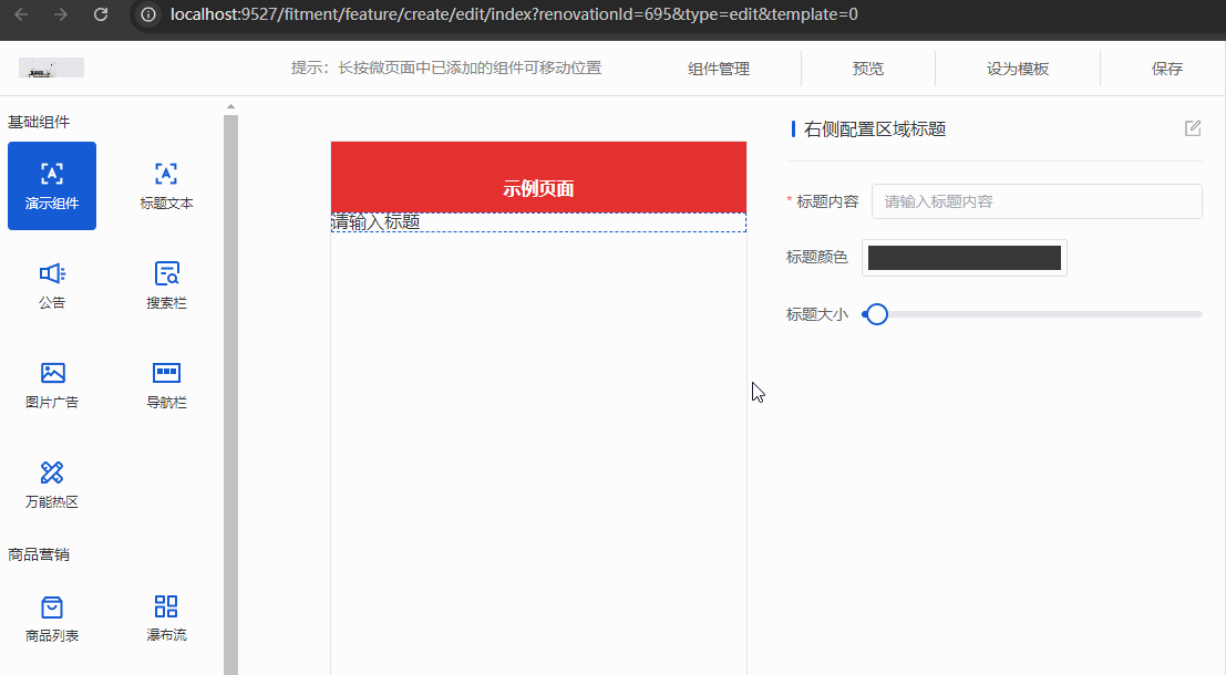
假设当前组件需要实现一个配置标题的功能,可以配置文本内容、字体的大小和颜色:
在 组件预览区域 和 组件配置 添加代码,并完善校验:
<template>
  <div class="Mall4j component-example-component">
    <!--  组件预览区域  -->
    <div class="design-preview-controller">
      <div
        class="title-text-title"
        :style="{fontSize:formData.titleFontSize+'px', color:formData.titleColor}"
      >
        {{ formData.title || '请输入标题' }}
      </div>
    </div>
    <!--  右侧组件配置内容  -->
    <div
      v-show="isShowEdit"
      class="design-editor-item design-hide-class"
    >
      <div class="design-config-editor">
        <div class="design-editor-component-title">
          <!--     组件标题 & 自定义标签     -->
          <div style="flex: 1;">
            右侧配置区域标题
            {{ currentComponent.customRemark }}
          </div>
          <!--     修改自定义标签弹窗     -->
          <custom-remark-edit-popover
            :index="currentUseComponents.findIndex(item => item.id === currentComponent.id)"
            :current-edit-component="currentEditComponent"
            @set-current-component="setCurrentComponent"
            @save-edit="saveCustomRemark"
          />
        </div>
        <!--    组件配置    -->
        <div class="design-editor-component-container">
          <!-- 当前组件的配置 -->
          <el-form
            ref="formDataRef"
            :model="formData"
            :rules="formRules"
          >
            <el-form-item
              label="标题内容"
              prop="title"
            >
              <el-input
                v-model="formData.title"
                placeholder="请输入标题内容"
              />
            </el-form-item>

            <el-form-item label="标题颜色">
              <el-color-picker v-model="formData.titleColor" />
            </el-form-item>

            <el-form-item label="标题大小">
              <el-slider
                v-model="formData.titleFontSize"
                :min="12"
              />
            </el-form-item>
          </el-form>
        </div>
      </div>
    </div>
  </div>
</template>

<script setup>
import customRemarkEditPopover from '../../../../../components/custom-remark-edit-poppver/index.vue'
const props = defineProps({
  isCheckMySelf: { // 是否开始内部验证 比如提示弹窗等。。。
    type: Boolean,
    default: false
  },
  currentComponent: { // 当前组件
    type: Object,
    default: () => {
      return {}
    }
  },
  indexKey: { // 当前组件排序索引 type_ + key
    type: String,
    default: () => {
      return ''
    }
  },
  current: { // 当前排序索引 key
    type: Number,
    default: () => {
      return null
    }
  },
  isShowEdit: { // 是否为编辑状态
    type: Boolean,
    default: false
  },
  dataField: { // 所有上传到后端的字段
    type: Object,
    default: () => { }
  },
  isStartCheckFieldRules: { // 是否开始校验规则
    type: Boolean,
    default: () => false
  },
  currentUseComponents: {
    type: Array,
    default: () => {}
  }
})
const emit = defineEmits(['myCheckResult', 'componentsValueChance', 'onErrorMessageTip'])

// 当前页面展示的配置
const formData = ref({
  title: '',
  titleColor: '#333',
  titleFontSize: 16
})

const formRules = ref({
  title: [
    { required: true, message: '标题不能为空', trigger: 'blur' }
  ]
})

watch(() => props.dataField, (val) => {
  if (val) {
    setFormData()
  }
}, { deep: true })

/** 设置或者重设formData的数据 */
const setFormData = () => {
  if (props.dataField) {
    for (const el in props.dataField) {
      formData.value[el] = props.dataField[el]
    }
  }
}

watch(() => formData.value, (val) => {
  if (val) {
    emit('componentsValueChance', {
      indexKey: props.indexKey,
      current: props.current,
      dataField: val
    })
  }
}, { deep: true })

watch(() => props.isStartCheckFieldRules, () => {
  startCheckFieldRulesCommonFun()
}, { deep: true })

onMounted(() => {
  setFormData()
})

/* 校验 */
const startCheckFieldRulesCommonFun = () => {
  let isPass = true
  let errorMessage = ''
  if (!formData.value.title.trim()) {
    isPass = false
    errorMessage = '标题不能为空'
  }

  if (isPass) {
    myCheckResult(isPass)
  } else {
    // element 表单校验
    showCheckForm()
    // 弹窗提示错误消息
    emit('onErrorMessageTip', errorMessage)
  }
}

/**
 * 返回校验结果
 * isHeader 是否为顶部 特殊情况
 * 结果:Boolean true false
 * */
const myCheckResult = ($isPass) => {
  emit('myCheckResult', {
    data: {
      isPass: $isPass,
      dataField: props.dataField,
      isHeader: (props.currentComponent.type.indexOf('config') !== -1),
      current: props.current
    }
  })
}

const formDataRef = ref(null)
/**
 * 可选
 * 当子组件不符合规则时,是否调用element ui 默认的规则判断
 * 需要默认结构为form
 * */
const showCheckForm = (cb) => {
  nextTick(() => {
    if (formDataRef.value) {
      formDataRef.value.validate((valid) => {
        if (valid) {
          if (cb) cb(valid)
        } else {
          if (cb) cb(valid)
        }
      })
    }
  })
}

</script>

<style lang="scss" scoped>

</style>
在后台管理端的移动端装修组件就完成了,接下来就是在uniapp项目中添加对应的渲染组件来把这它展示出来
uni项目中添加组件
移动端项目中装修组件路径为:src/components/feature/all-feature
在此目录中创建 example-component 组件,并写入以下内容:
<template>
  <view class="Mall4j example-component">
    <view
      :style="{
        color: fieldData.titleColor,
        fontSize: fieldData.titleFontSize + 'px'
      }"
    >
      {{ fieldData.title }}
    </view>
  </view>
</template>

<script setup>
const props = defineProps({
  fieldData: {
    type: Object,
    default () {
      return {}
    }
  }
})

onMounted(() => {
  console.log('props', props.fieldData)
})
</script>
创建好组件后把它引入到装修组件列表,并完成配置即可;
打开 src/components/feature/feature.vue,在以下位置补充代码:
<template>
  <view class="Mall4j micro-box">
    <view
      v-for="(item, index) in list"
      :key="index"
    >
      <!--   新增的示例组件   -->
      <!--   v-if判断中type为后台管理新增时指定的组件唯一标识   -->
      <example-component
        v-if="item.type === 'example_component'"
        :field-data="item.dataField"
      />
    </view>
  </view>
</template>

<script setup>
// 其他引入
// 引入新增的组件
import exampleComponent from './all-feature/example-component/index.vue'
...
</script>
到这一步移动端自定义装修组件就完成了:
